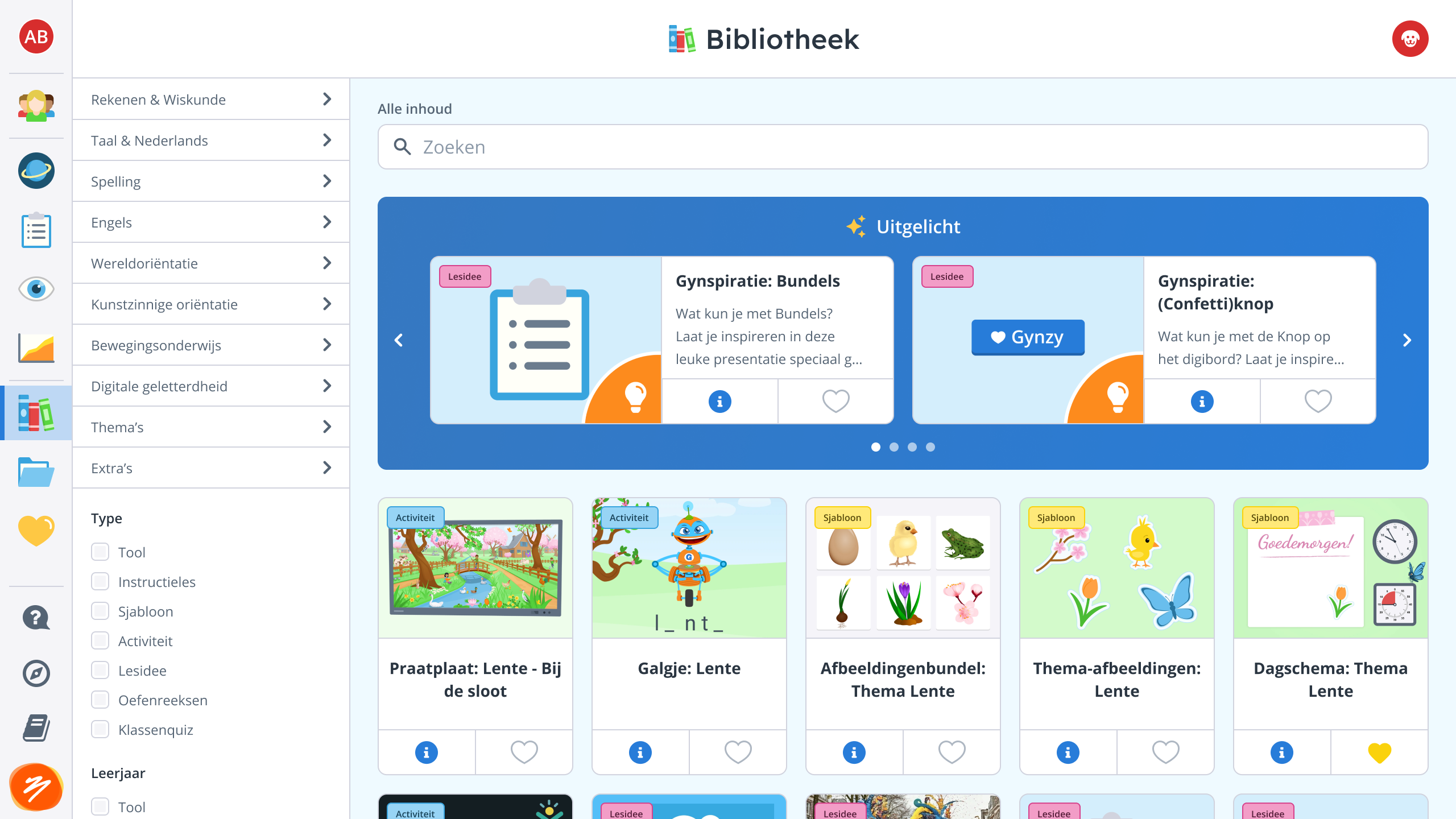
The challenge
- Navigation was a left sidebar of unlabeled icons — teachers couldn't figure out what they meant
- The landing page after sign-in wasn't even the top icon, causing immediate disorientation
- Zero room left to add new features without degrading the experience further
- Multiple development teams independently flagged the scalability problem
- The Ember and Flutter applications had different scaling behavior across devices
- Teachers use desktops and interactive whiteboards — cursor and touch input both had to work
Before — Icon-only sidebar in Ember
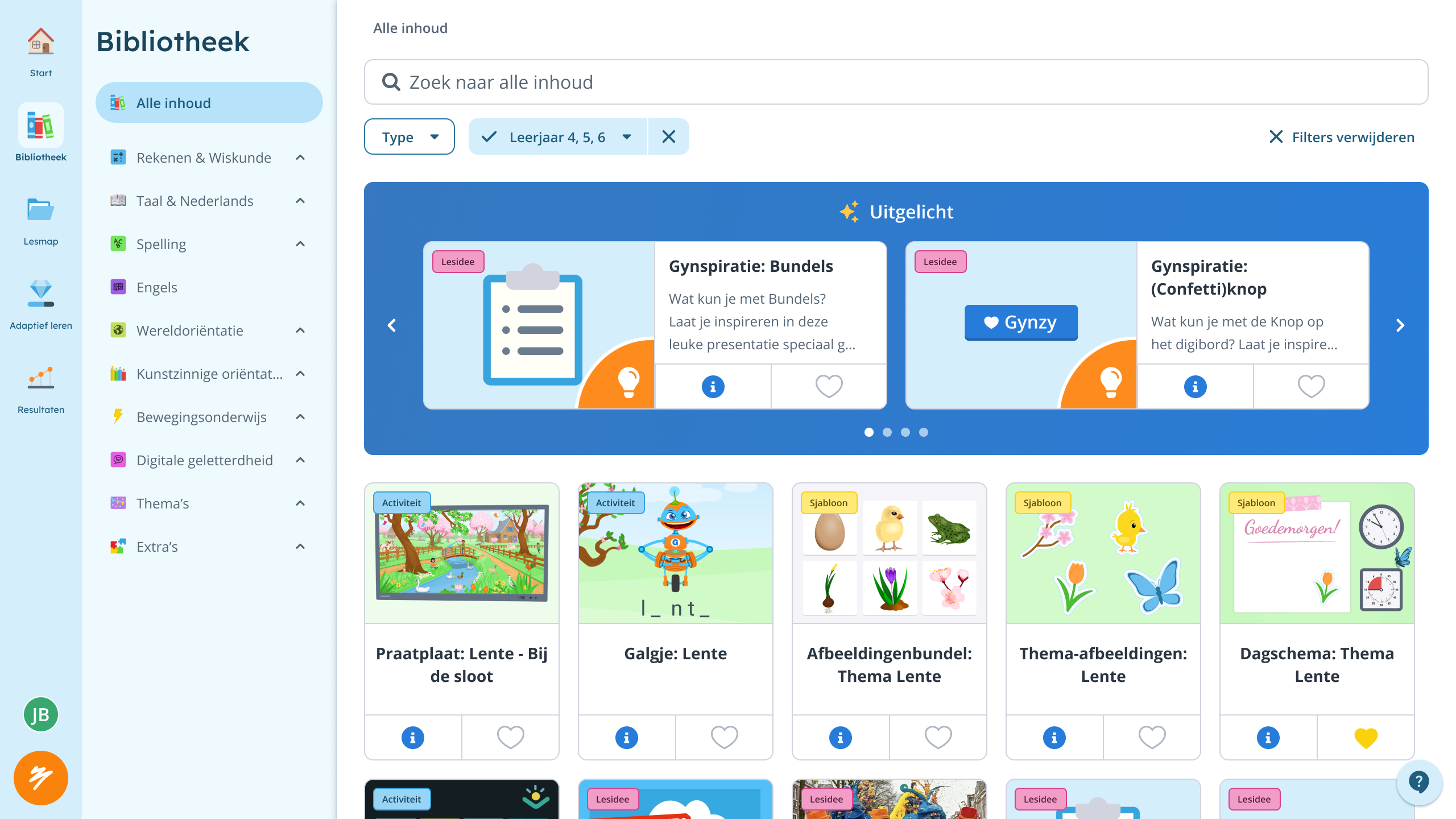
After — Redesigned library navigation
Making the case
Data alone wasn't enough to convince stakeholders. I presented the experience through the eyes of a first-time teacher — walking through the confusion step by step. That shifted the conversation from "is it good enough?" to "this is hurting users."
The slide deck I used to present the case for overhauling navigation.
The solution
Research insights
- Amplitude data revealed which features teachers actually used vs. which went untouched
- Card sorting with educational experts showed teachers think about tools very differently from how we'd organized them
- Usability testing confirmed that simply relabeling icons wouldn't be enough
- Key insight: teachers needed a fundamentally different entry point, not a better toolbar
Design constraints
- Hover-to-expand menus worked with a mouse but fell apart on whiteboards teachers tap in front of a class
- Responsive scaling had to work consistently from small laptops to large interactive displays
- The Ember→Flutter migration meant reconciling two different rendering behaviors
Implementation
The scope was too large for a single release, so I proposed three sequential phases — shipping improvements incrementally while building toward the bigger vision.
Phase 1 — Clean up & rebuild
- Removed non-core features from the sidebar
- Rewrote the Ember-based toolbar in Flutter
- Reduced clutter and established a maintainable codebase
The toolbar transition from Ember to Flutter.
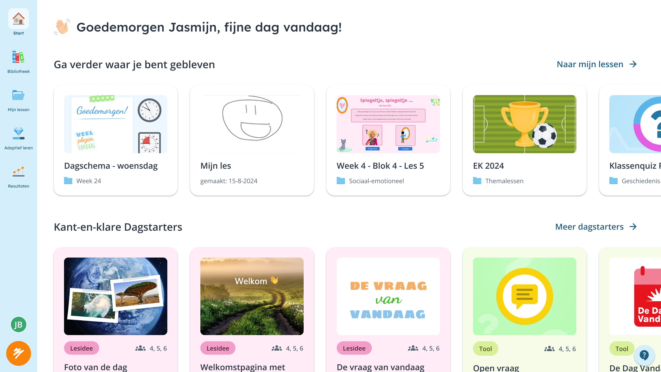
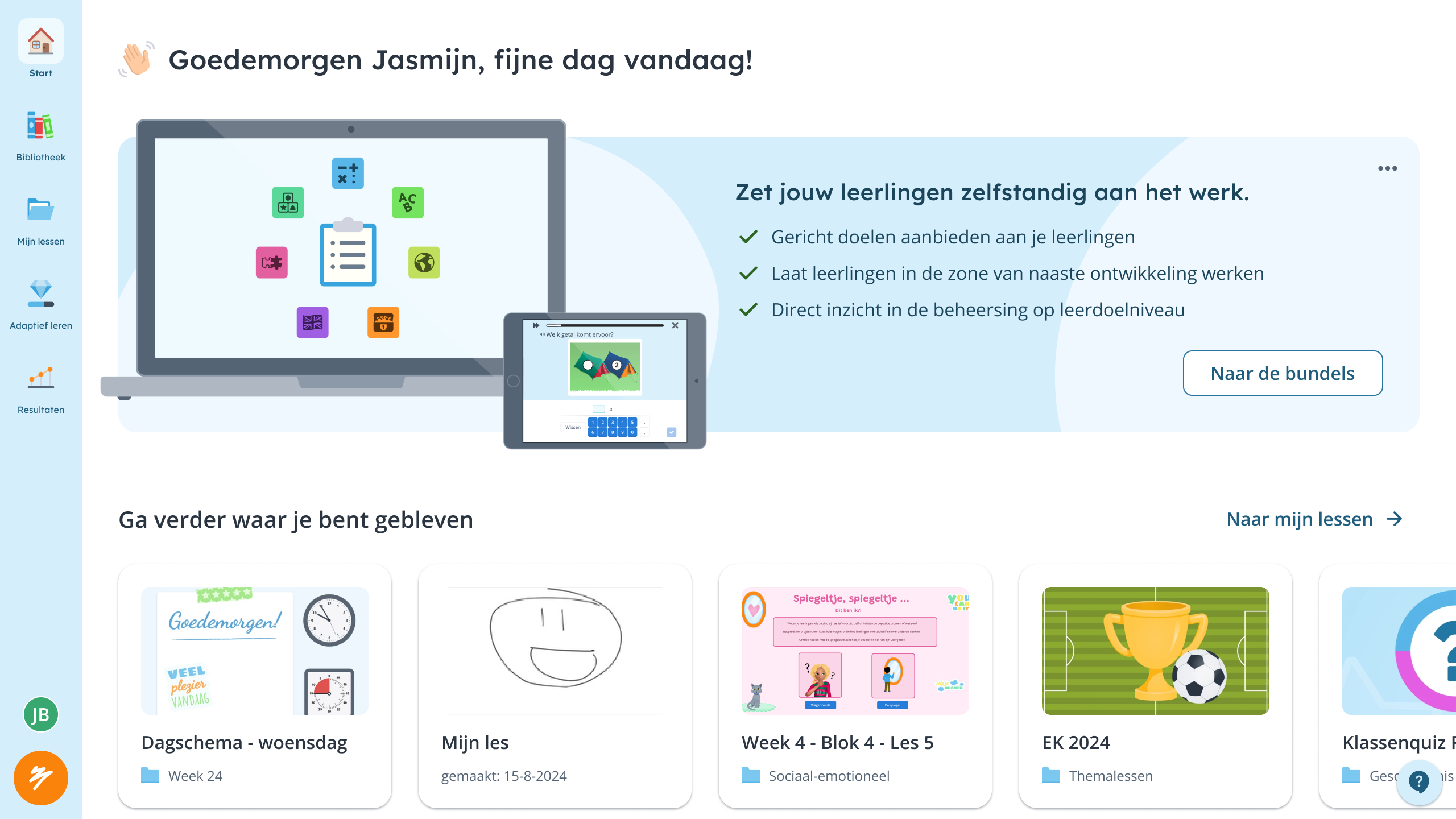
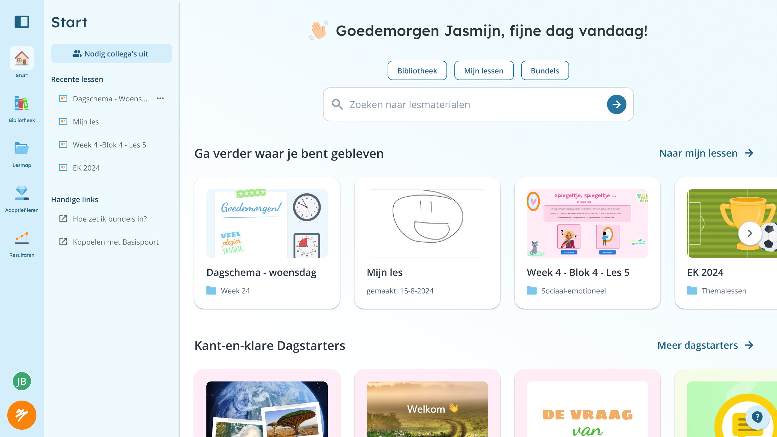
Phase 2 — The Start page
- Introduced a dedicated landing page so teachers see their schedule immediately after sign-in
- Evolved from a promotional first version to a personalized daily hub
- Single biggest improvement: opening a lesson went from 3 clicks to 1
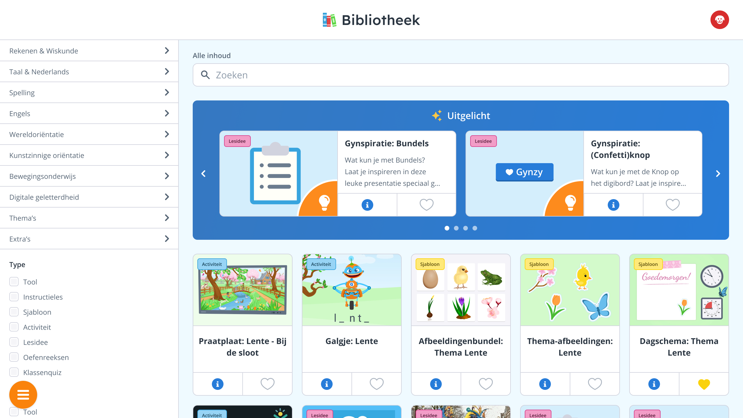
First iteration — Promotional landing page
Live — Seasonal highlighted content
Future — Search bar & secondary nav
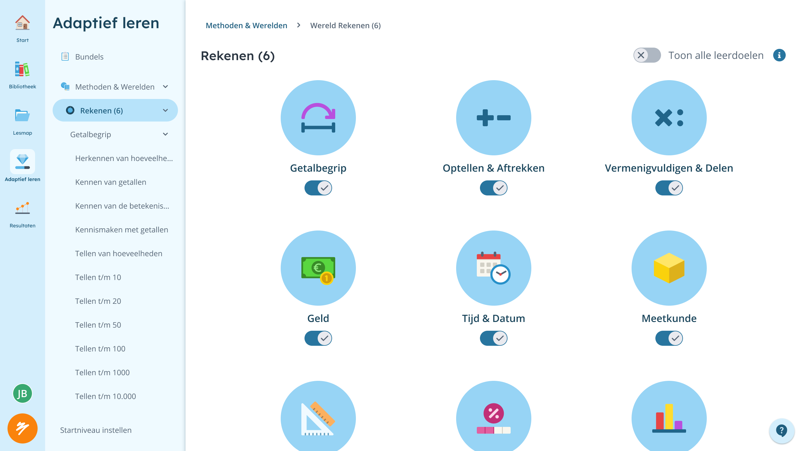
Phase 3 — Secondary navigation
- Added a secondary navigation layer — everything lives on the left, giving users a consistent mental model
- Created room for new features without mixing horizontal and vertical patterns
Collapsed — Category icons only
Expanded — Full category list
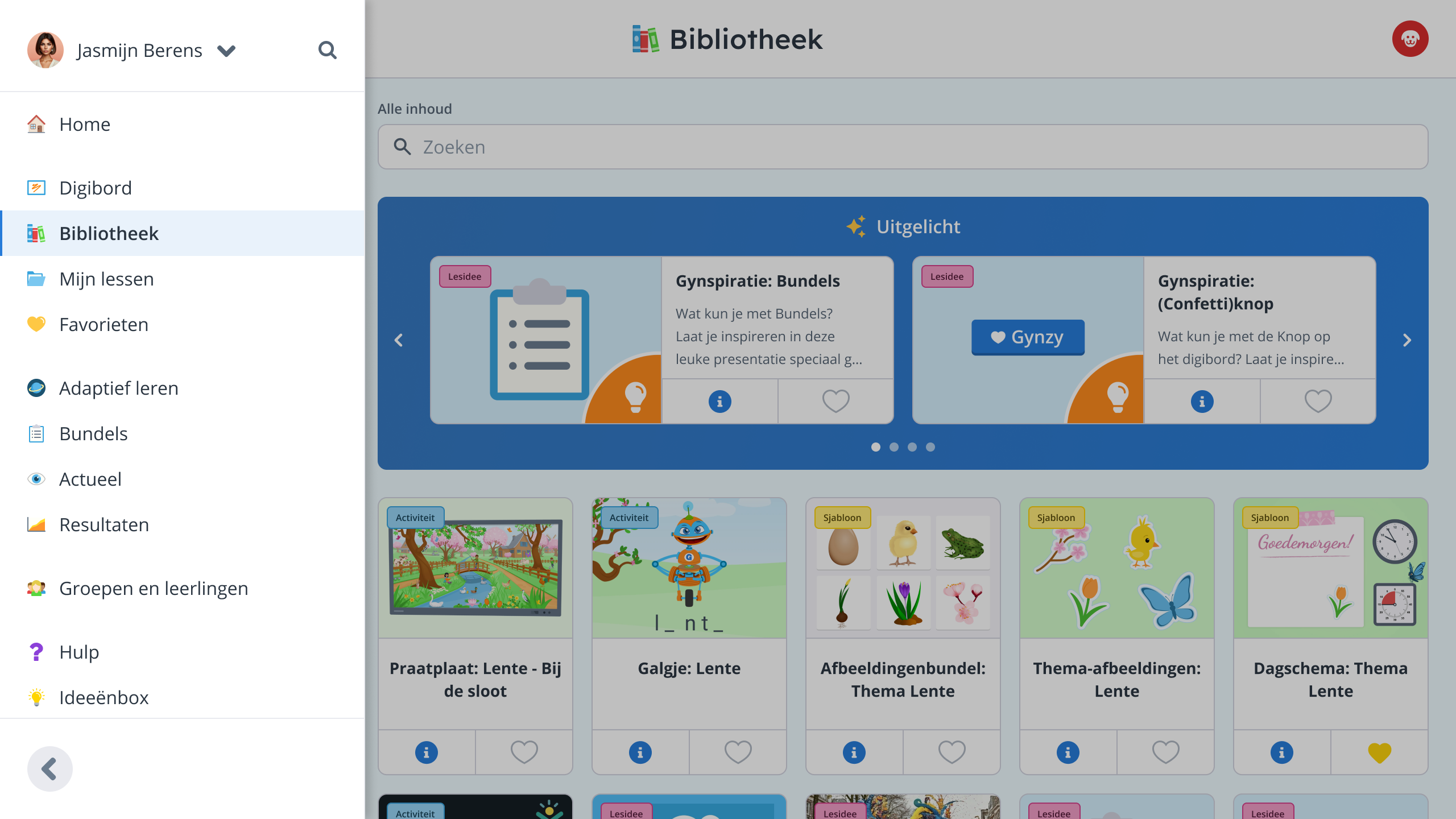
Early exploration of the secondary sidebar — a collapsible category menu that could expand in place.
Lesson folders — Tree navigation
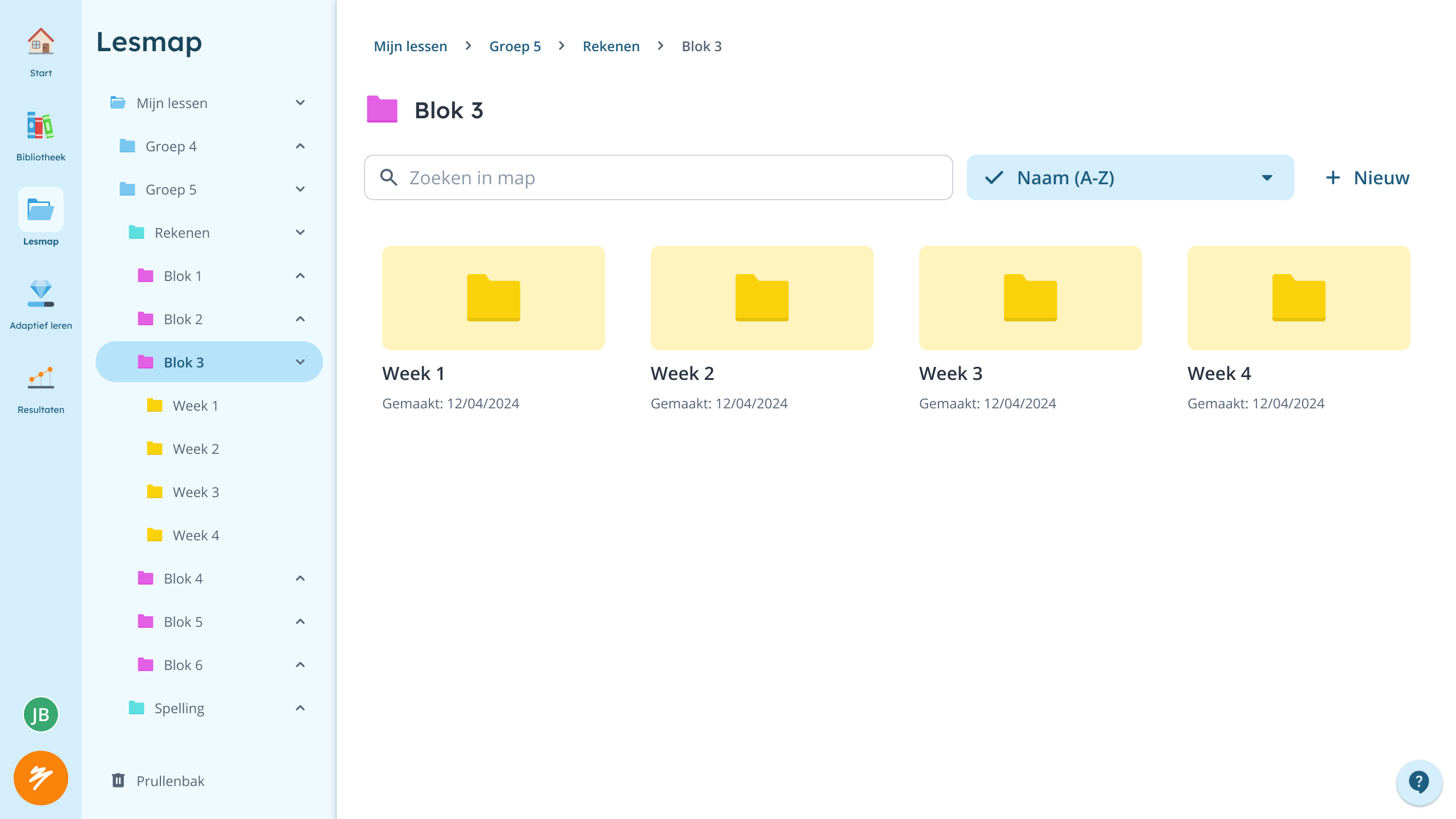
Curriculum — Subject hierarchy
The secondary navigation in tree-like views — folders and curriculum structures that need hierarchy without leaving the page.
Results
- Lesson access went from 3+ clicks to 1 — multiplied across thousands of teachers using this dozens of times daily
- Navigation architecture now scales — new features have a clear home
- Mixed Ember/Flutter codebase consolidated into Flutter
- Responsive scaling works consistently across all supported devices
- Product team went from "we can't add anything" to having room to build