The challenge
- Gynzy's design system started in Sketch and was migrated to Figma — but the migration was a straight copy-paste, with no rethinking of structure or naming.
- The design team refreshed the color palette because the old colors felt dull, but without a token architecture to support it, the update had to be applied manually everywhere.
- Components were being recreated without shared rules — designers built what they needed in the moment, leading to inconsistency across the product.
- As more work shifted to the student environment, the problem multiplied: every component essentially needed a teacher version and a student version.
Bulky icon set with heavy stroke weight
Outdated inner shadows, minimal roundness, oversized icons
Limited color range with dull tones
The solution
- When the organization committed to Flutter, the migration created a natural moment to rethink the design system from the ground up.
- Instead of maintaining separate component sets for teachers and students, I introduced an alias layer — a set of semantic tokens that map to different values depending on context.
- The alias layer controls spacing, padding, typography, and sizing — so a single component adapts automatically to the teacher or student environment.
- I also prepared the alias structure for whitelabel use, building in variable modes that could support different brand contexts in the future.
Primitive tokens — Raw values, context-unaware
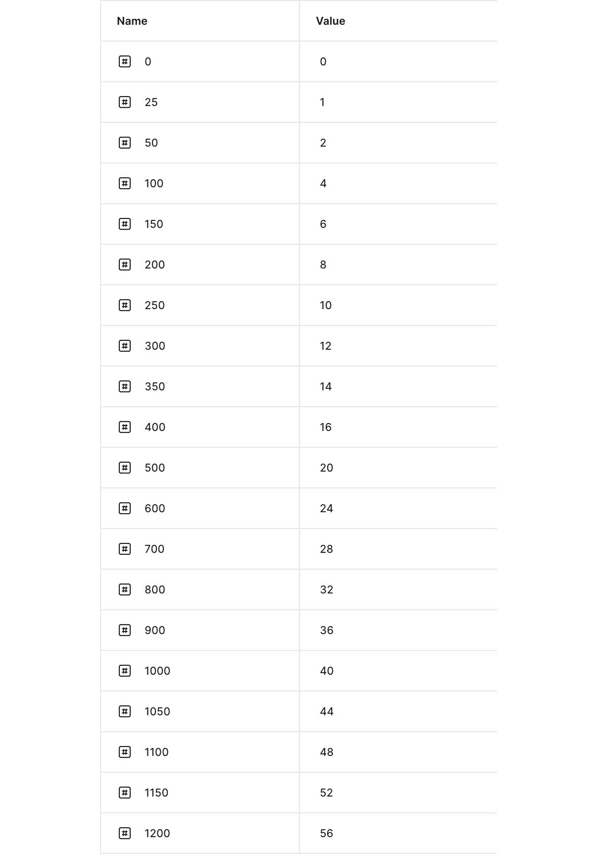
Alias tokens — Mapped per context (Teacher / Student)
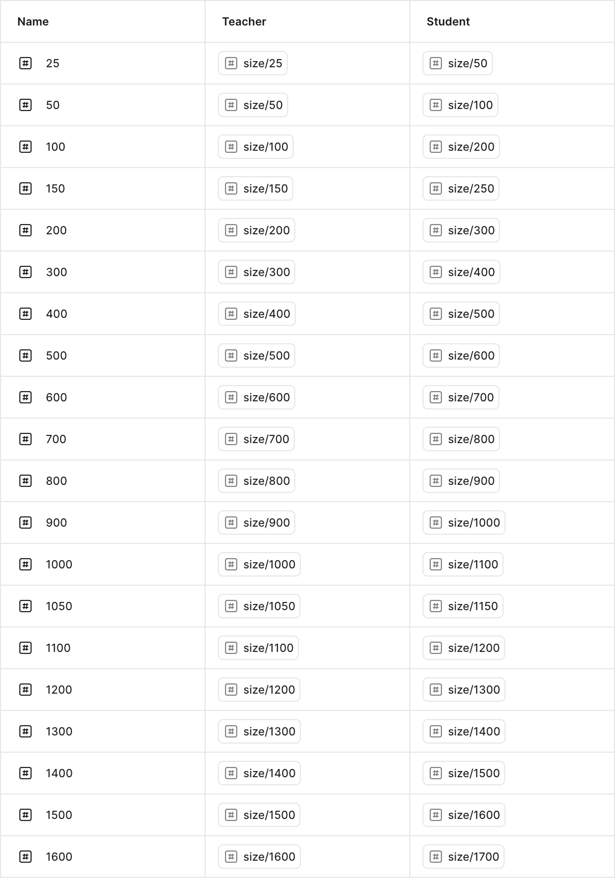
Primitives define raw values. The alias layer maps the same token name to different primitives per context — so components don't need to be duplicated.
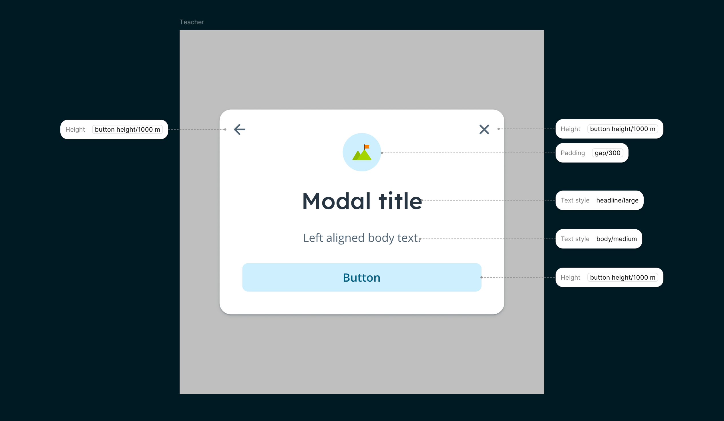
Teacher context
Student context
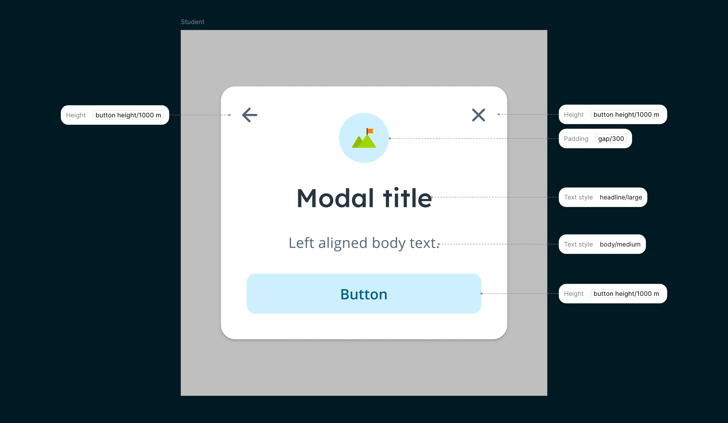
Same component, different context — the alias layer adapts spacing, typography, and sizing for teachers and students without duplicating the component.
Implementation
- Worked closely with a developer to define how tokens would translate into Flutter's theming system.
- Rolled out incrementally — migrating components one by one rather than doing a big-bang switch.
- The developer handled the scaling logic between Flutter and the remaining Ember parts of the application.
- Once AI tooling became available, I could add and update token values and create components more independently — speeding up the process significantly.
Results
- New components can be created faster because the token structure does the heavy lifting.
- A more consistent experience across teacher and student contexts, built from shared components instead of parallel versions.
- The visual language was refreshed — brighter and more intentional — without needing a separate redesign effort.
- The alias layer is future-proof: whitelabel support is built in from the start.
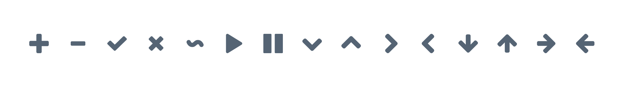
Before — Bulkier, heavier stroke weight
After — Lighter, more elegant line work
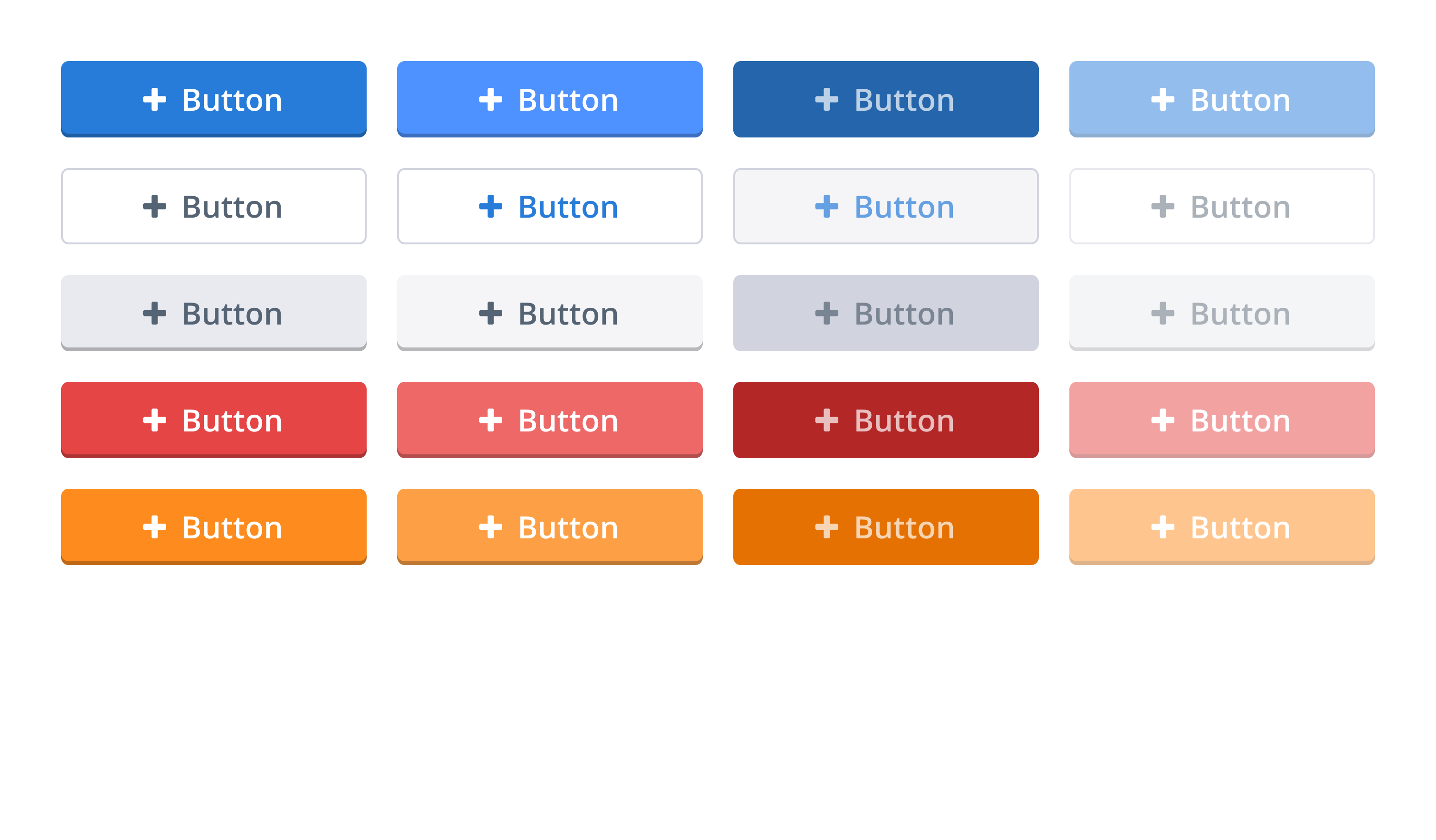
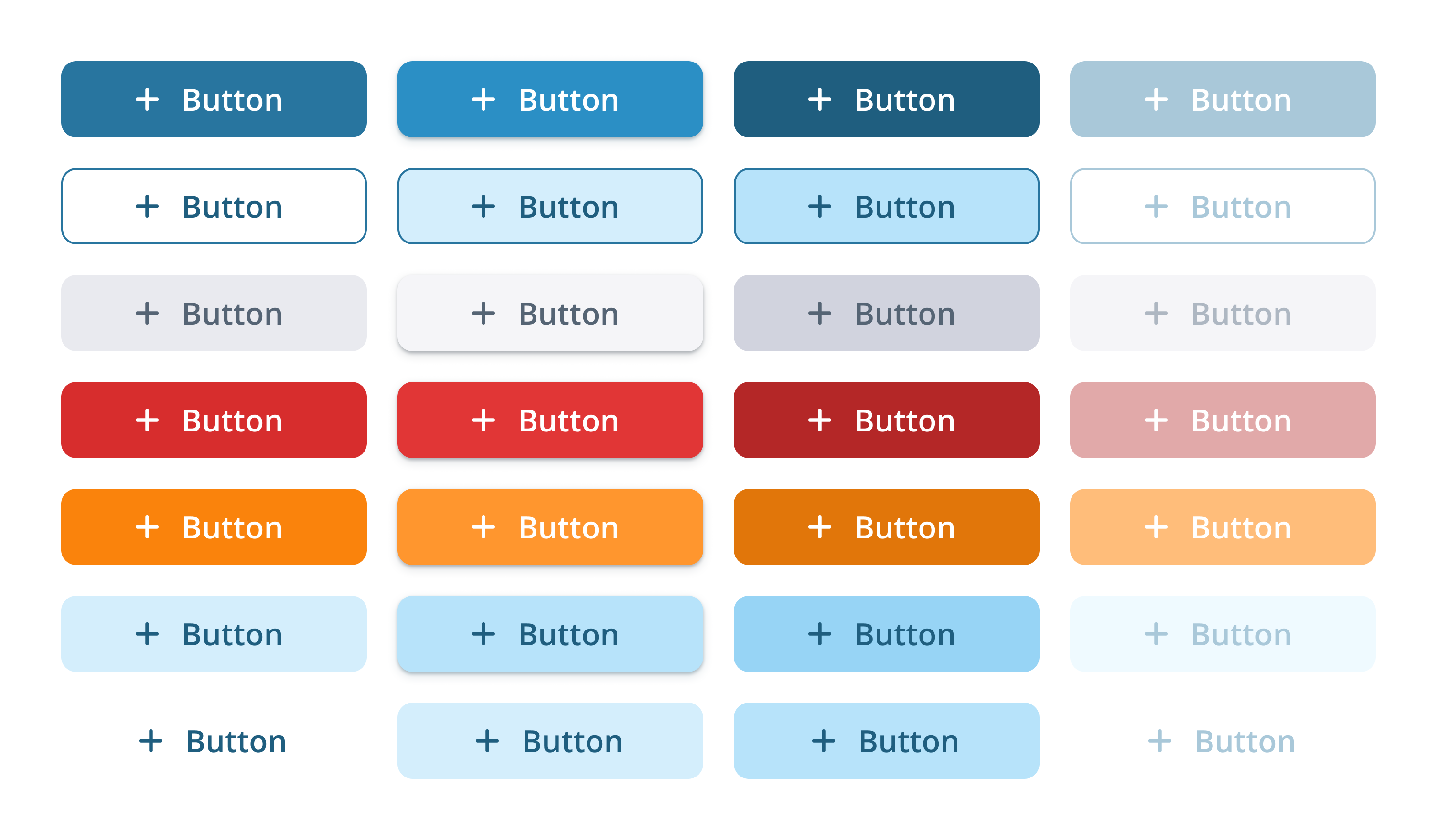
Before — Outdated inner shadows, minimal roundness, oversized icons
After — More roundness, no inner shadows, better icon-text balance
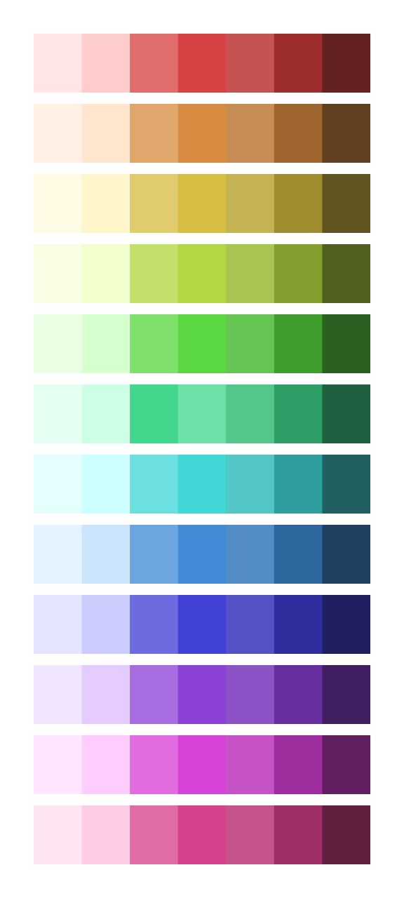
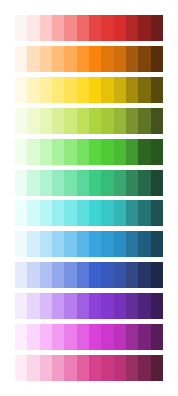
Before — Limited color range with dull tones
After — Expanded palette with vibrant colors
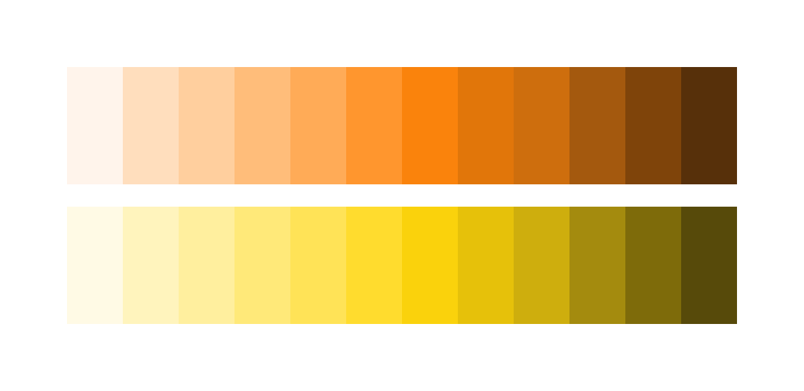
Before — Orange & yellow lacked vibrancy
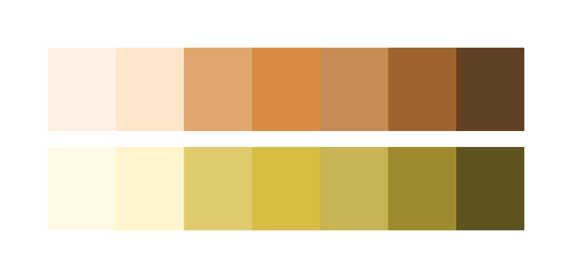
After — Brighter, more playful range
For a product used by teachers and students, color matters. The old palette felt dull — the refresh brought the vibrancy the product needed.